
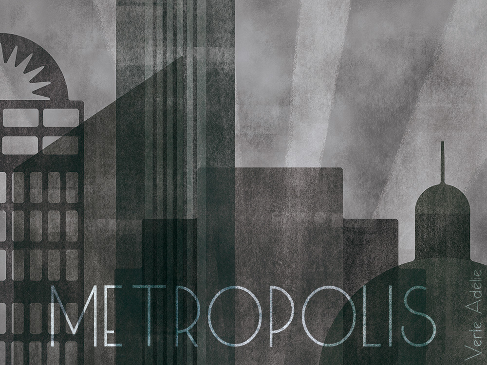
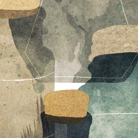
This week’s theme on Illustration Friday was too tempting to resist: Metropolis. It’s hard to read that word without immediately thinking about Fritz Lang’s movie, isn’t it? I didn’t even try to snap out of that influence, and aimed from the start to create a dark, vintage-inspired image. Almost to my surprise, the final result is very close to the kind of atmosphere I had in mind, with a hint of Fritz Lang (?) and a pinch of Sky Captain and The World Of Tomorrow. I hope.

Since the image looks a little bit like a poster, adding a title seemed like a natural step. It was hard to pick a font, though, or maybe it’s just because I have too many to choose from, thanks in part to Design Cuts (where I also found the ink textures heavily used in this illustration)! The dotted version (Marujo) is less obvious than the others and makes the atmosphere slightly more cheerful, which I like too.

Since some of you appreciated last week’s animated gif, here’s another one showing some of the main steps of the process. I used Illustrator to create the basic shapes of the buildings and Photoshop for everything else, (very muted) colors and textures.


futuregirl
Feb 26, 2015 -
I really love this one! I, too, like the dotted font. Not only is it a bit cheerful, but I also get a “hey let’s develop this advanced technology without thinking about the consequences … and, oops, we just destroyed the world” vibe. :)
Verte Adélie
Feb 26, 2015 -
Ha, thanks A, I love what that font is telling you! :)
Verte Adelie | Flying bunnies pattern, or to each her own obsessions
Mar 5, 2015 -
[…] rabbits floating on the screen during the end credits. See, in case you wondered if I’d post another thing inspired by a bleak German 1927 movie like last week, you can stop worrying, […]